Every quilt I make right now is scrappy. I just love scrappy. It can work through a large fabric stash really effectively. Quilts made with simple color palettes with just a few colors, or all solids, for example, can completely transform when made using a scrappy sort of “recipe”.
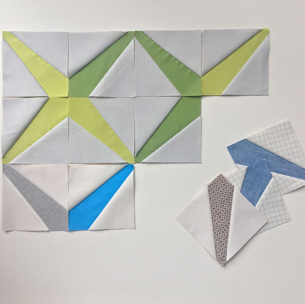
I keep a project set up by my sewing machine to work on a little each day. It helps me feel like I’m working towards a goal and making something, especially on those days when I am chained to the computer all day. My current project is Carolyn Friedlander’s Sessoms Quilt pattern. Its a paper pieced pattern, and one that I wanted to use as a basis for playing with color and form. I started out doing a few blocks in a basic color palette of blues and greens, which I thought was pretty. But, I soon got bored of the parameters I’d set for myself (I talk about this at several points in my book– make up rules to follow for each quilt, but break them when you are ready or bored and see where it takes you).
Even though this palette is pretty to me, and I could envision a quilt with this mood and feel, I also want to use up my scraps. I know that this palette could potentially have me buying more fabric. My goal for these daily sewing projects that I keep by my sewing machine, at the ready, is to NOT buy more fabric to make them.
So I decided to get scrappy.
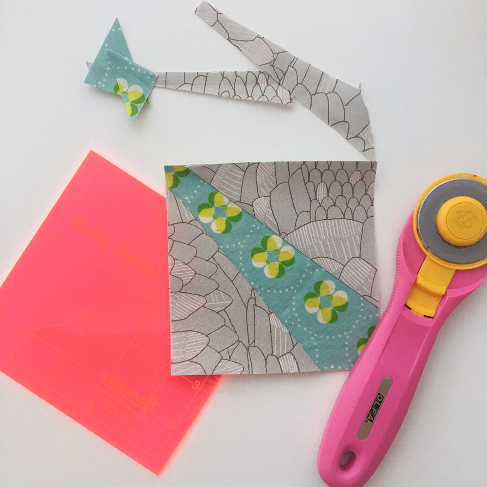
Getting scrappy with my fabrics also allows me to stretch the value differences between them, really play with light and dark forms in the individual blocks, which I really enjoy. I thought it might be interesting to see how I do this using my Ruby Ruler™.
Dark and light value differences between fabrics is very obvious in a lot of fabrics we use. You don’t need a Ruby Ruler™ to show you those, you can look at them and tell in an instant. The reason I created the Ruby Ruler™ in the first place was to show me the subtle value differences between fabrics which don’t immediately look lighter or darker than each other. The value differences that don’t jump out at you right away are the really interesting value relationships. Playing with these can create dynamic quilt designs.
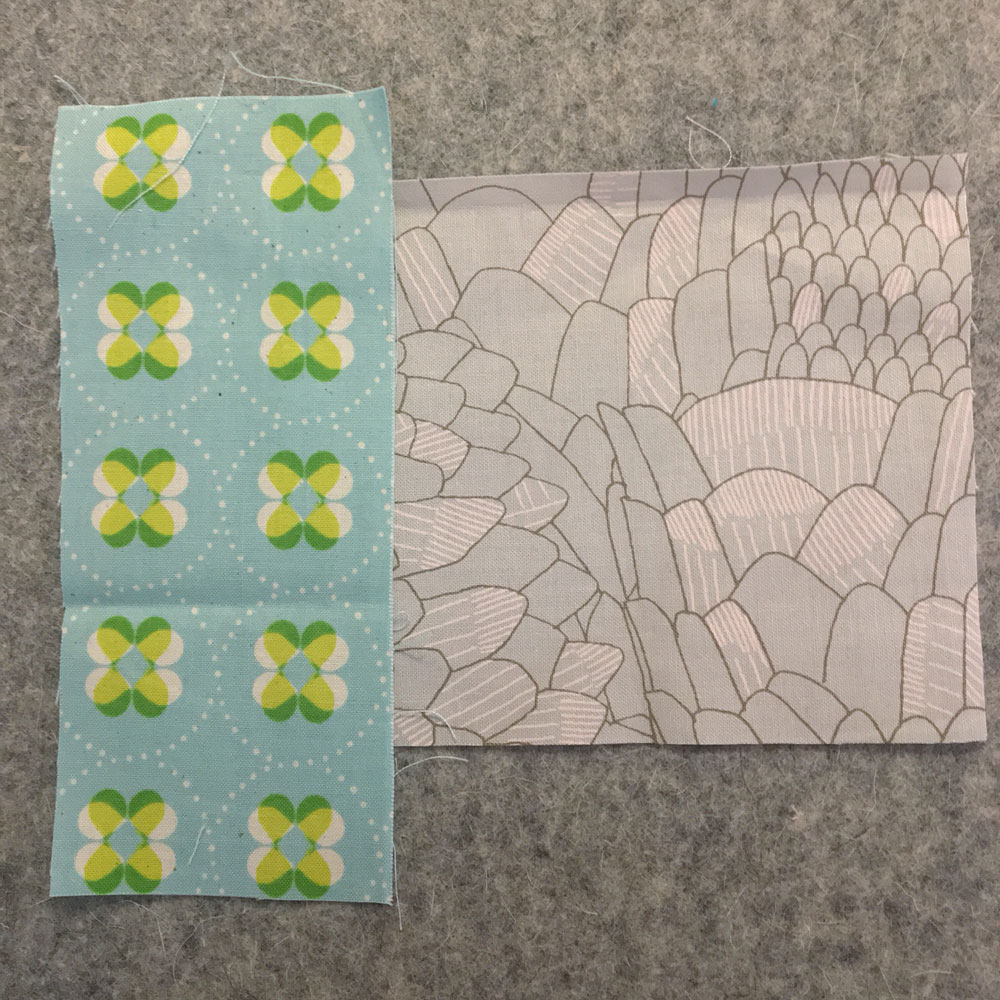
I decided that I would make the diagonal center bar area always a darker value, and the two sides a lighter value (at least that’s how I’m starting. Again, until I change my mind.) I pulled two fabrics from my stash, below. They do not have strong value differences when you look at them this way. Some of you might think the fabric on the left is the darker valued one, and others might think the right is darker.
Neither is necessarily the wrong choice, it all depends on what your intended use is.
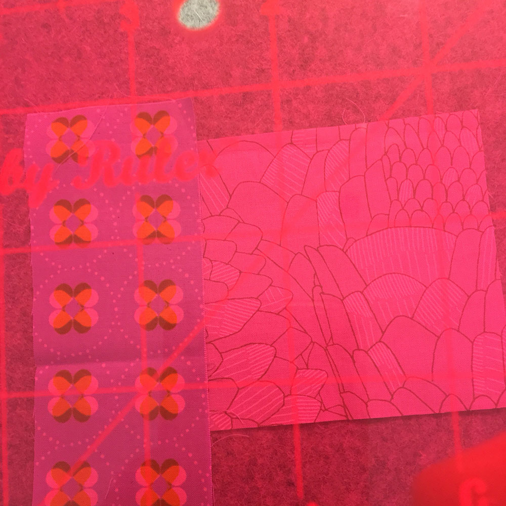
I knew I wanted to figure out which is darker. By looking at them through the Ruby Ruler™, the value difference emerges, and the ruler doesn’t lie. The fabric on the left side is clearly the darker valued of the two. But keep in mind, that this is the just the relationship between these two fabrics. I teach my students that value relationships are relative. Meaning- the fabric on the left could become the lighter valued one if placed beside another fabric that is darker.
So, now what? Its these value differences, the subtle ones, that create what I refer to in my quilts as the “sparkle”. Trusting what the ruler shows you, and using it in your “quilt recipe” (darker value will always go here, lighter value will always go here…) will help the eye see high and low, dark and light, in your quilt. Value defines form. Then, when you repeat these subtle value differences over and over, in a quilt top, you suddenly have created a lot of form and sparkle.
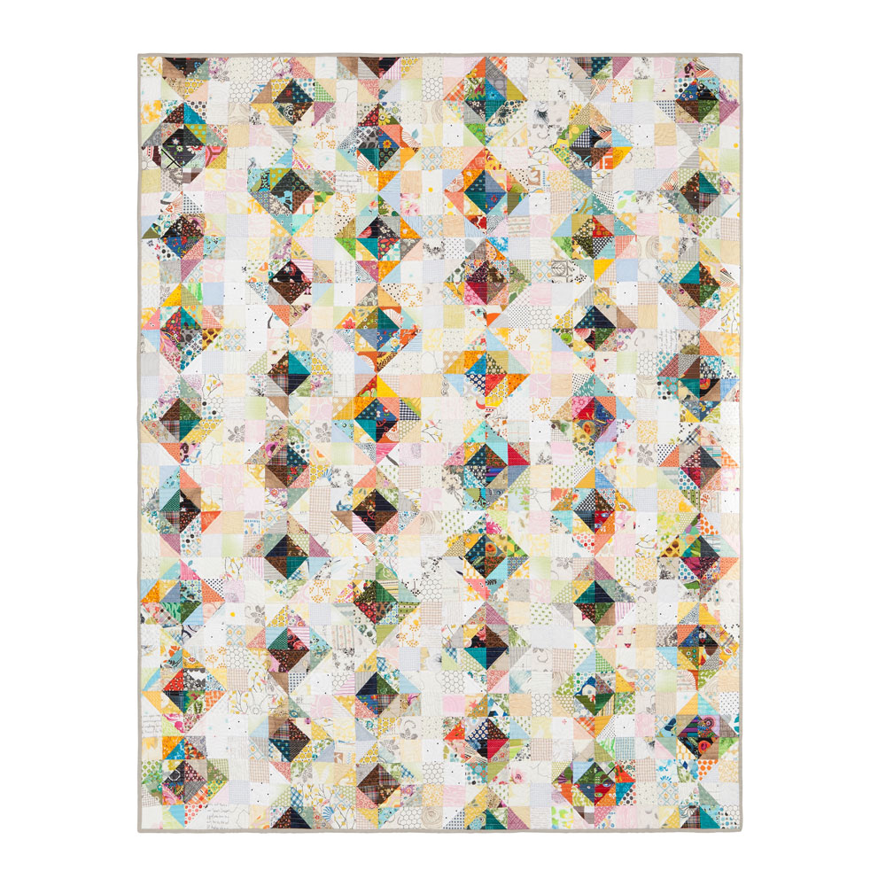
This is exactly the “quilt recipe” I used in the “Value” quilt I designed for my book–
I hope this helps you understand value a little better. Its one of those concepts that take just a little bit of deep thought, until “aha!” and you’ve got it forever.
