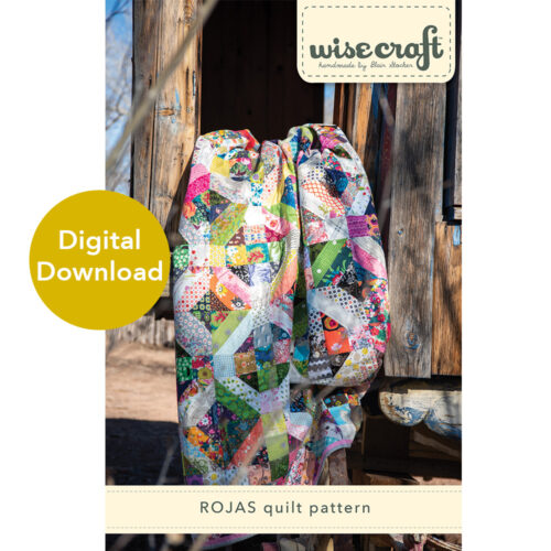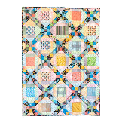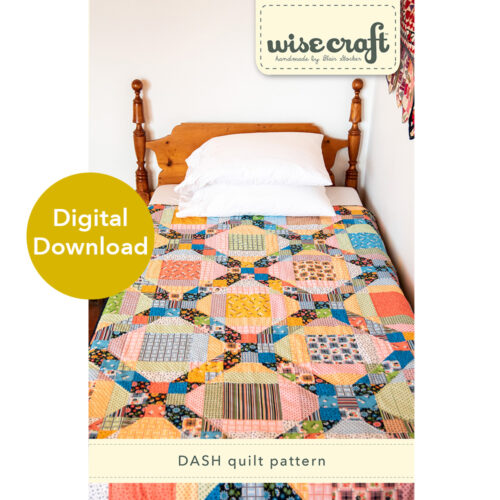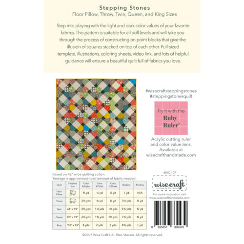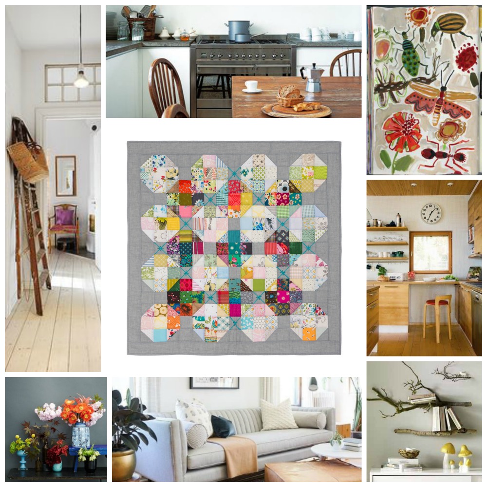
I talk alot about the idea of “quilt sparkle” in my workshops and classes. An idea that is illustrated so well when playing with color value. Color, layout, and the “sparkle” are all things that I feel very intuitively in my work, and its taken me a long time to create a verbal or written explanation as to exactly what I mean, or how I achieve it.
Color Value can seem a bit technical to those who don’t consciously use it in their work. It may feel a little bit like checking our choices against a color wheel. (Which I never do, by the way.) It feels like there’s a rule that must weave its way through our design choices, when we may already feel overwhelmed at the idea of choosing colors and prints.
But I will be the first person to tell you that this is simply not so. Guess what- we already look at color value and make decisions about it every single time we design a quilt. We decide if something feels too light, dark, muddy, garish- we make all sorts of judgement calls on the fabrics we pull and put into a quilt. Maybe you don’t realize it, but you are also looking at color value comparisons.
But let’s get back to the idea of quilt sparkle. Color can visually sparkle in all sorts of projects, not just quilts. But quilts are an easy way to show what I mean.
Alright Blair, what is quilt sparkle?
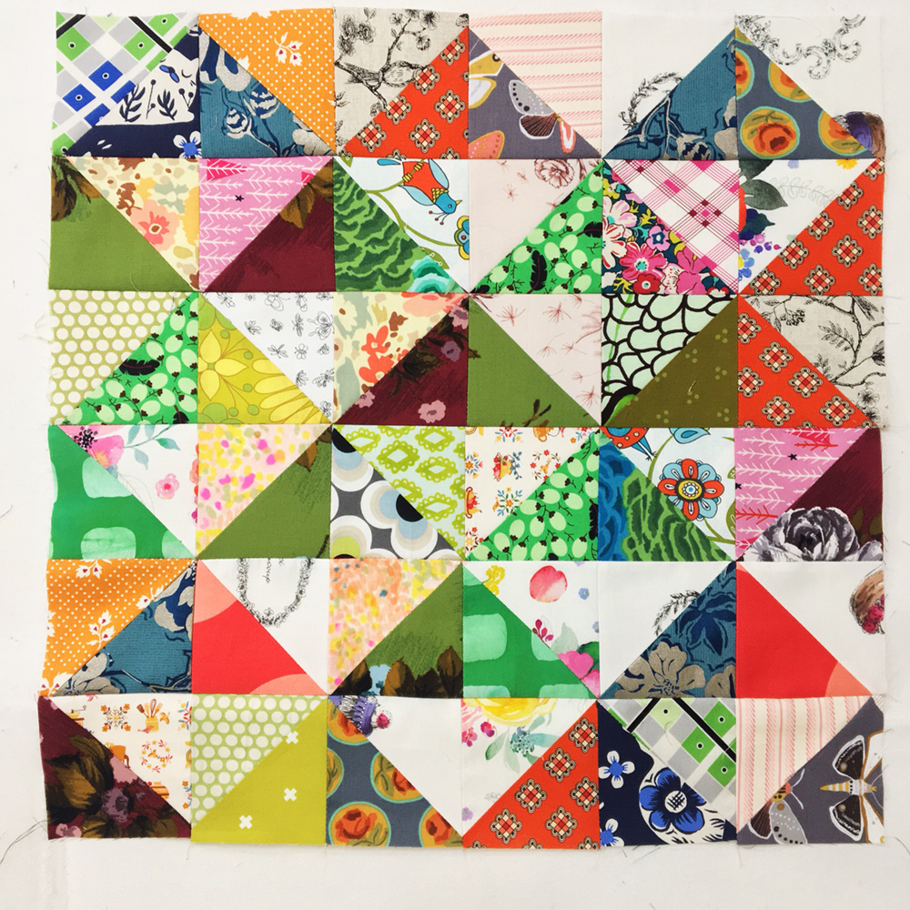
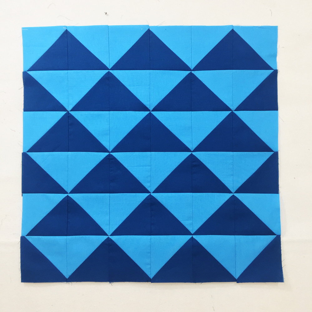
The patchwork sample below is lovely, feels modern, the blues are a favorite, etc. It has good color value contrast between the light and dark blues, etc. In fact, I think its pretty calming to look at. The visual information we are getting immediately is that it is a repeating pattern. We know at first glance that the pattern is repeating. That’s what will happen. No matter where we look on the pattern.
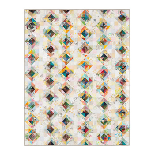
The example below takes the same patchwork pattern and, instead of making it out of two contrasting colors, it instead uses two contrasting values. It is composed of lots and lots of fabrics, and the designer (me!) has divided them into two value categories- light and dark. I have decided that some fabrics will be used as darks and lights.
But!-
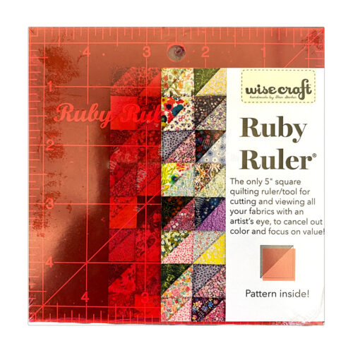
Some darks are darker than others, and some lights are lighter than others. If they were all exactly the same, you’d have the pattern above. Instead, by mixing these dark and light “darks”, and the dark and light “lights”, a more dynamic version of the pattern has emerged. There’s a beautiful ✨sparkle✨ that leads your eye all around the quilt design and has you looking at all the details. I invented the Ruby Ruler™ to help me see these values quickly and often. Having the ruler with me when I’m working allows me to look at dark and light color value at every step of the process- at the fabric store, when pulling from my stash, cutting and piecing units together, the design wall.
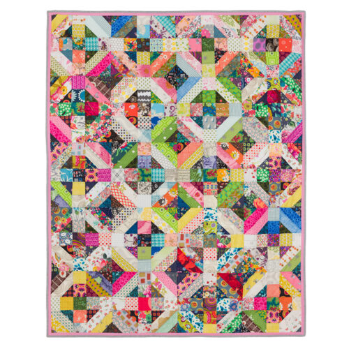
By being intentional with color value decisions, a totally different design is created!
I hope this demystifies the idea of quilt sparkle a little bit. Learning to understand what it can do for your quilts can lead to some truly delightful designs!
