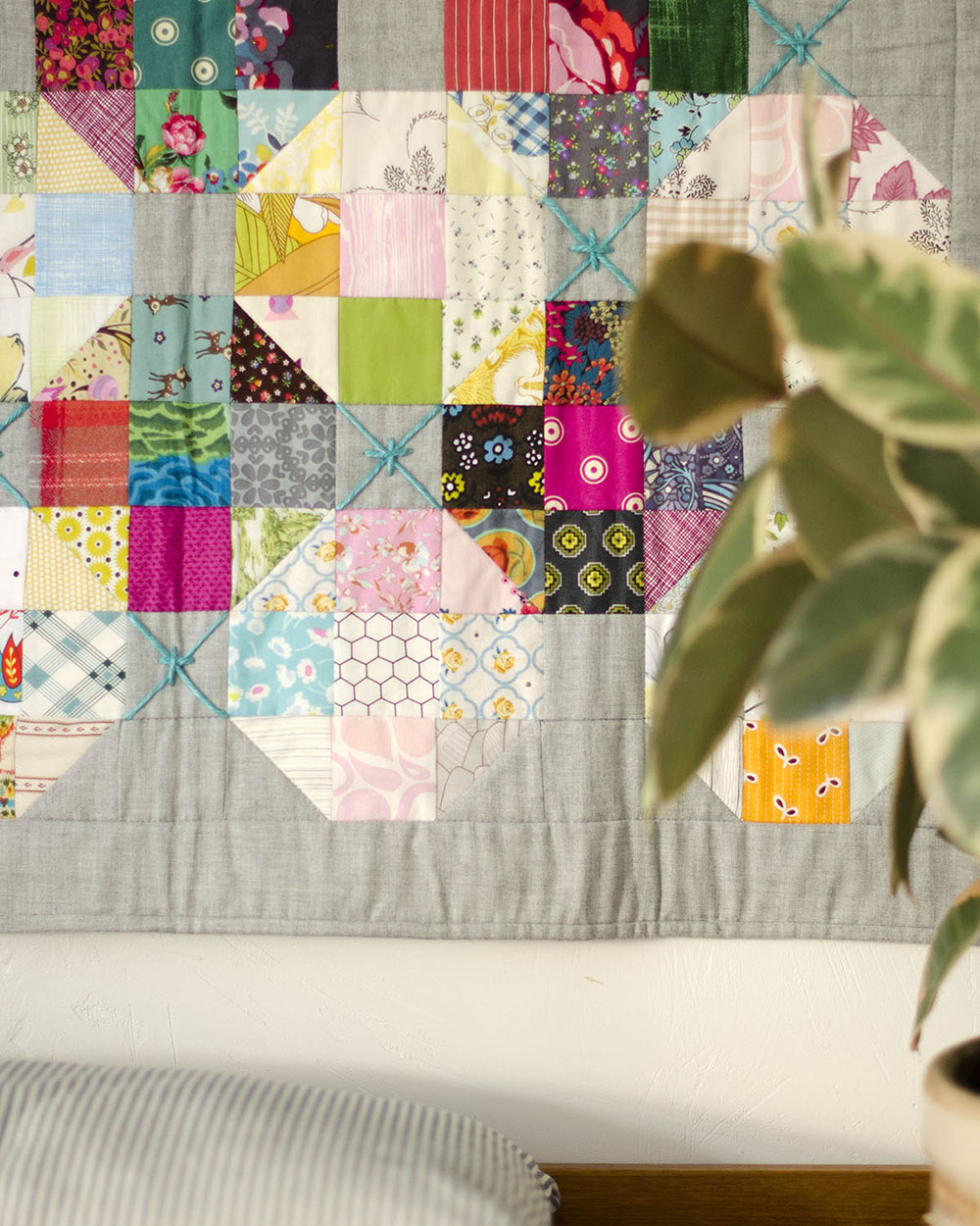
The challenge a scrappy quilt poses fascinates me constantly. They are bit like a puzzle, with all the pieces fitting together to create a scrappy story that is most successful when it creates a visual story. Creating a good visual story with scraps is a great challenge for me. I start every one of these quilts from my fabric stash. I love the idea that I am constantly dipping into and using up all those fabrics. That’s why I bought them, right? But did you know that some fabrics are better to use than others? I have two tips for you!
Each new scrappy quilt I make begins with an open mind- that any fabric will work (printed or solid, depending on the quilt). I spend time choosing ones from my stash, then lay out my fabric pull to study it all together through the Ruby Ruler™ or the Ruby Minder™. I pay close attention to what I like or don’t like about I’m seeing.
However, even with an open mind, experience has taught me that certain fabrics just work better than others. It takes a little practice to train your eye for what will work best for your quilt, but once you understand these simple guidelines, you can veer from them (or ignore them completely) when the design warrants a different perspective.
1. Small prints for small pieces
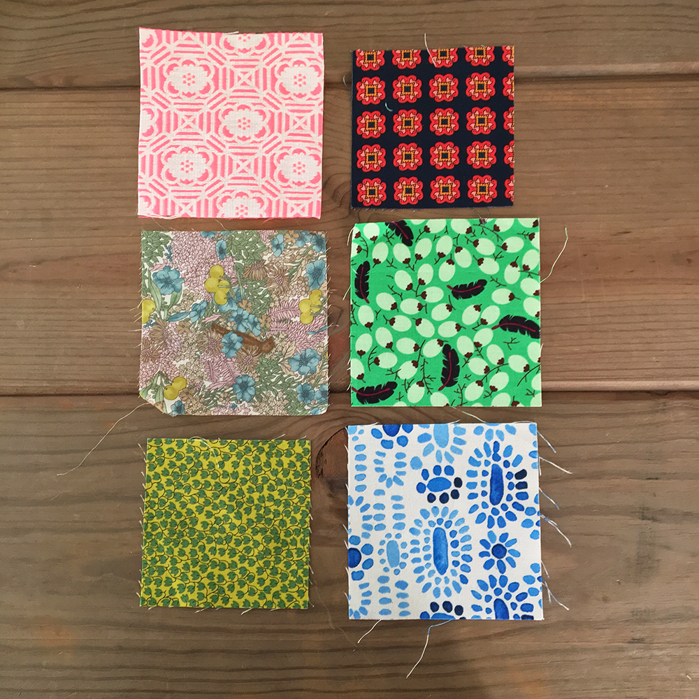
If you work with smaller sized pieces (my rule is 5″ and smaller), smaller prints will be more successful in scrappy quilts. In the apparel industry we used to call the fabrics with small motifs on them “ditzy” prints. The motifs can be one or many colors, that doesn’t matter so much. They can be a regimented repeat, or scattered, either is ok. Whatever works or doesn’t work within this type of print different with every quilt. But if the print is small in scale, the color value and effect it has in the overall quilt is much more predictable. Also, if you find you need more of a ditzy print in one quilt, once the design is laid out, you can cut more of that fabric knowing how it will look in the design. Here are some examples-
In this group of fabrics, all the prints are small in scale. Ditzy prints. They would work beautifully in a scrappy quilt made of small units. Any of these fabrics could be batch cut into squares and you could depend on the consistency from square to square-
These would work great!
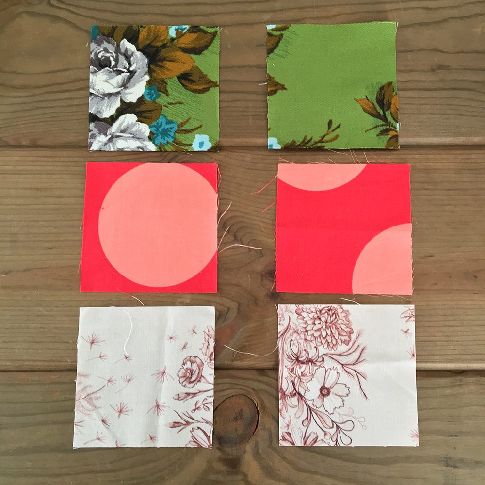
In the grouping below, I’ve cut 2 squares from each print. The print scale of each fabric is much larger. Depending on where the print lands in each square, you’d get different values from square to square. Some might be light, some might be dark. To get consistency from square to square, fussy cutting would work, but waste a lot of fabric. I would use these prints sparingly in a scrappy quilt when I’m making a design based on value. It would just be too hard to get consistent value “information” from square to square in the same print. Plus, there are tons of pretty small prints on the market (and likely in your stash!) to choose from.
These? Maybe not as great!
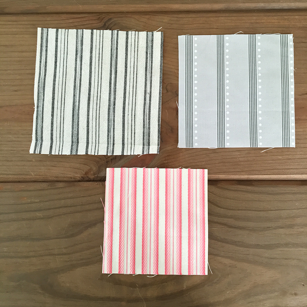
2. Avoid strong linear designs
Strong lines are something I have learned to avoid in my scrappy quilts. (Again, keep in mind I’m referring to 5″ and smaller cut squares.) I find them very distracting. Cut them off grain the tiniest bit and there’s no hiding the skew of the stripe in the final square.
The examples below are two yarndyed stripes and one printed. These are fabrics I would avoid. They risk feeling strong, possibly even jarring, in a value-based, scrappy quilt. That’s not to say I’ve never used them, there’s always exceptions! Just not an obvious choice.
Strong linear designs
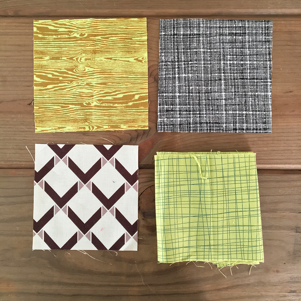
Alternatively, I would choose any of the fabrics below to use in a scrappy, value quilt. These would all work. Yes, even the strong diagonal pattern of the lines on the bottom left. Its a distinct linear pattern, but being a diagonal doesn’t create the same effect visually as straight lines. We view the diagonal more as a pattern and less as a stripe. Plus, it satisfies point 1, above. Meaning its a smaller design and would be consistent in color/value from square to square.
Not so strong
What about you? Tell me your scrappy quilt successes and no-nos. I’ve love to know.