“It is the best possible sign of a color when nobody who sees it knows what to call it.”
– John Ruskin, 1859
Color development is a very intuitive process for me, and has been since my days in apparel design. There was not a color wheel to be found in that environment. There were lots of other factors we considered in choosing seasonal colors, but there were not color theory rules in the traditional sense. We needed to rely on instinct, past sales, future trends, and brand identity. During that period of my life, I learned to sharpen and rely on my personal color sense very well. I had to. No color wheel was going to help me know what would sell to our customers.
What does Color Intuition mean?
These days of making and teaching about patchwork, I realize that many quilters do not feel they have strength in that area. However, I truly believe that color intuitiveness is a skill you can learn, discover about yourself, and exercise/strengthen.
If you come to the craft of quiltmaking with a desire to relax and be told what to do, and what to do it with–like a quilt kit with everything in it–then you don’t need to strengthen your color intuition because you are getting what you want from your quilting practice.
However, if you have a desire to express yourself and your point of view through quilts, color plays a big role of that. Even if you think about color in your quilts as “filling in the blanks” (a blue here, a warm color there…), these are still choices you are making, likely from fabric you have pulled from your stash. A stash is a collection of fabric you have chosen to buy or keep for whatever reason, and it reflects you and your aesthetic.
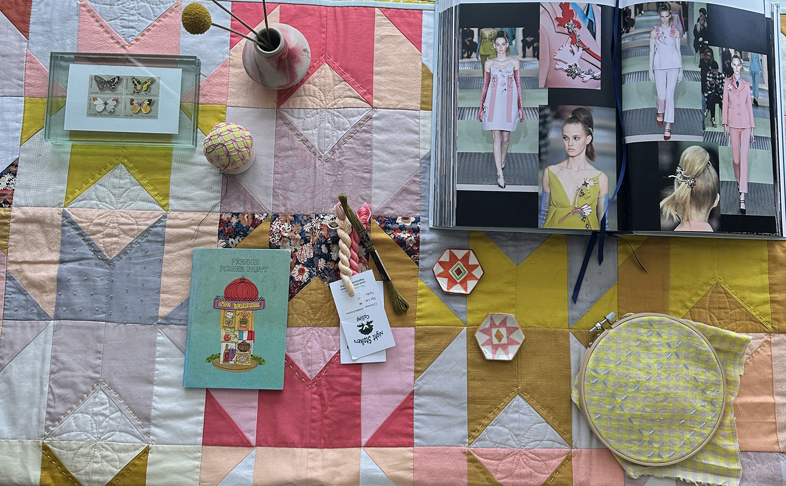
We Learn it by Noticing and Paying Attention
For example, it wasn’t until the last 7-8 years of my quilting practice that I actually realized I do not care for most colors of red. I had made many quilts by that time, bought many printed fabrics, combined them in lots of ways, sewed them together, etc. so I must have known it on an unconscious level. But at some point it dawned on me that not only did I not use lots of red in my quilts, I didn’t tend to buy or look for many fabrics with reds as the primary color. My quilts reflected this back to me before I even noticed it.
These are the sorts of creative discussions with myself that I learn alot from. Color is a visual language, one worth paying attention to. I looked back over patchwork I had made with a different lens and starting noticing things I hadn’t paid much attention to before. For example- certain colors next to each other excite me creatively. Other color pairings I may avoid for whatever reason. But adding a third color into a pairing I don’t get excited by can wake up the pairing.
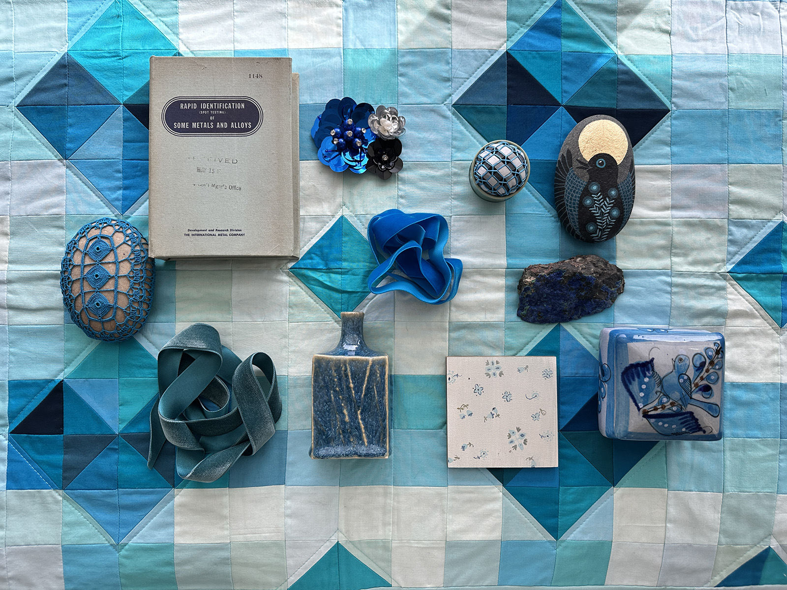
These are the sorts of internal dialogues I have with myself that I learn alot from. Color is a visual language, one worth paying attention to. Part of what I love about quiltmaking is the ability to combine one color with another in a way that feels perfect to me. And I am a big believer that we can all do that as well. It’s all about noticing and paying close attention. Over time, we learn how each color does or doesn’t feed us creatively.
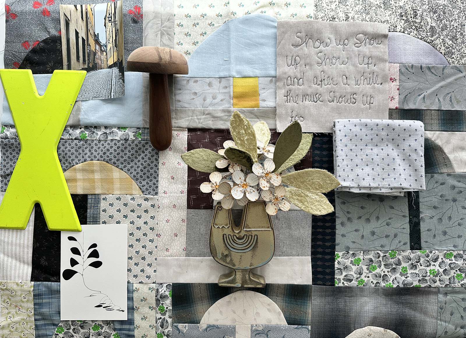
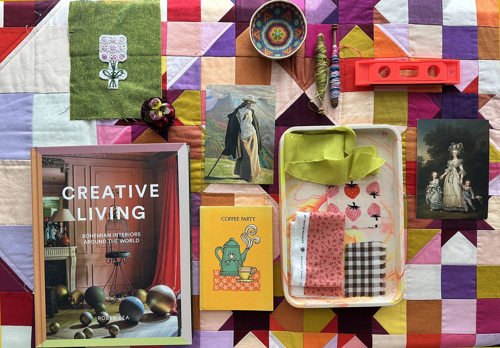
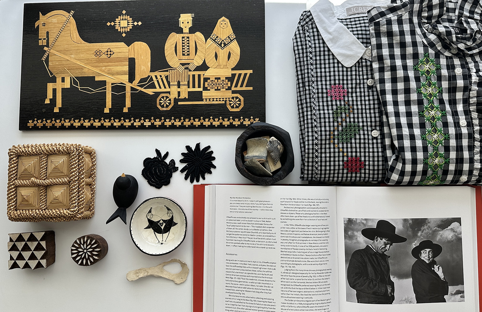
The images in this post are from my teaching week earlier this year with MISA here in Santa Fe. I set up a table each day with components of what I’d hoped to be a color conversation. I think it was popular with the students and it got me thinking even deeper about how teaching color is a skill to develop, just like recognizing our own personal color language.