For years I made quilts not really giving much conscious thought to color value. I was more focused on the color and the prints (my favorite part of quilting- choosing the fabrics and the colors). I had worked with color for years as an apparel designer and merchandiser. Color is my zone of comfort. And I felt like I must be incorporating some color value into all my color decisions, but I wasn’t entirely sure.
Maybe color value is something you don’t really want to think about. After all, you are already thinking about colors…AND the pattern…AND cutting…AND piecing the blocks…
Is color value really all that important in quilting? My answer- A BIG YES! Color value can transform a quilt design if used with intention. Understanding the color value work within my quilt designs has completely changed how I make quilts. And now I want to help all quilt makers understand how to use color value for their own work.
Let me introduce you to my world of color value!
Keep reading to get my best tips on using color value in your quilts!
These days, I design my quilts paying close attention to color values of any group of fabrics I use in my quilts, and it has truly changed the quilting game for me.
A little background…
I came to quilting from a career in apparel design and merchandising, about 25 years ago. Never having made a quilt, I began my first ones by repurposing fabrics like t-shirt and baby clothes. Scrappy quilts. The fabrics themselves may have been unrelated, but the memories they represented were what was important. That was what I thought of as a quilt- a patchwork of scraps and fabrics from other things.
But coming from a design background, I was curious about creating an elevated quilt design, and how to do that using fabrics that had nothing much in common. My first quilts felt a bit scattered to me when I completed them, design-wise.
I know that I get a creative charge when I am given design parameters, instead of a blank slate with no parameters, so I wanted to create some simple design rules for any quilt I did, to work within.
That’s when I started playing around with color values. And let me tell you- it changed everything.
Now I want to demystify the concept of color value for others, because successfully using color value in any quilt is magic🪄!
Color Gets All The Credit, Value Does All The Work
This is an old and very true statement. I love color, and have always been pretty good at instinctively combining colors and creating quilts that are glow with color. But I know that color value also plays a very large role in that. What I mean is, if a quilt feels successful in color, in design, etc, color value likely has a lot to do with that success.
Conversely, if the opposite is happening, and a quilt design isn’t feeling quite right, or if you feel like that special something seems to be missing from your layout, it could be that the color value isn’t doing what it should.
So let’s lay out the important parts of color value that I recommend you should pay attention to in your quilts.
Understanding What Color Value Really Is
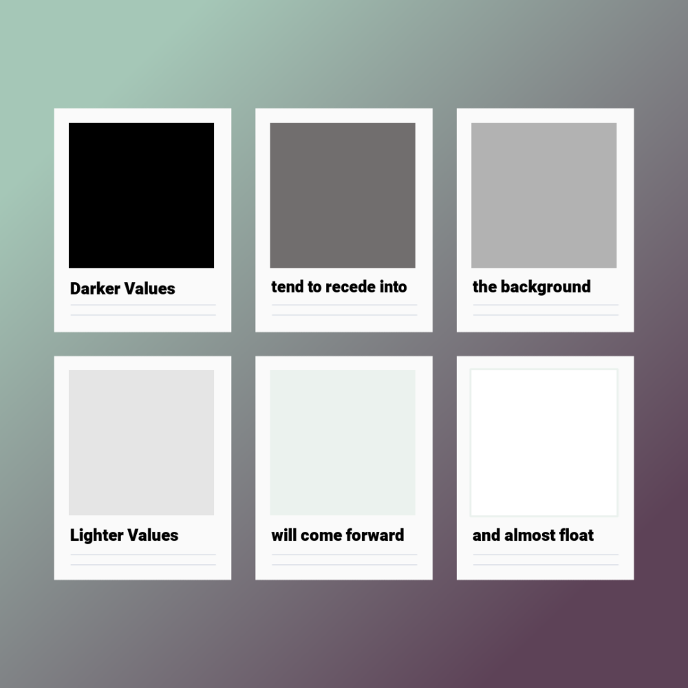
The simple definition of color value- it is the lightness or darkness of a color.
- A darker color value will recede, go backwards/deeper in the design. If you have ever heard the term “sunshine and shadow” in quilting, these values would definitely be your shadow 👤areas. They help to define the forms and shapes you see in the design.
- A lighter color value will come forward visually, almost lift up from the surface, creating areas of sunshine ☀️. These areas can have a lovely glow to them.
For all of the above to happen, dark and light values must be present. They work together to create forms and shapes.
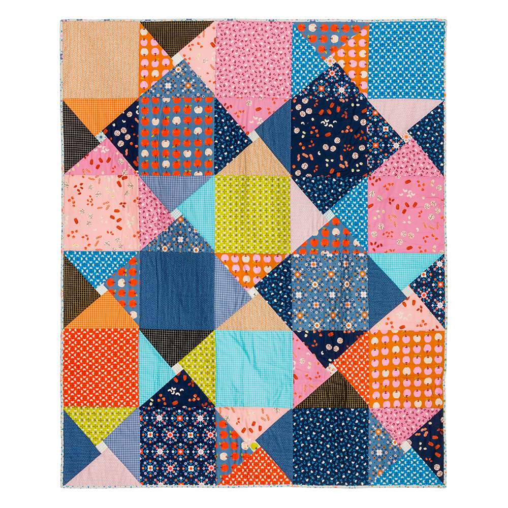
Do you see the shapes and forms, or dark and light values, in the quilt below?
Those shapes you see are accomplished by having both dark and light color values in the design, and knowing how to lay them out.
Try Looking at Your Stash from A Color Value Perspective
Now that we’ve established what color value is, the next point to understand that the color value of a fabric is not the same as its color. For that, you need your chosen fabrics to “talk” to one another.
Let’s look at an example-
The color of the fabric below is blue. But that doesn’t really tell you what it’s color value is.
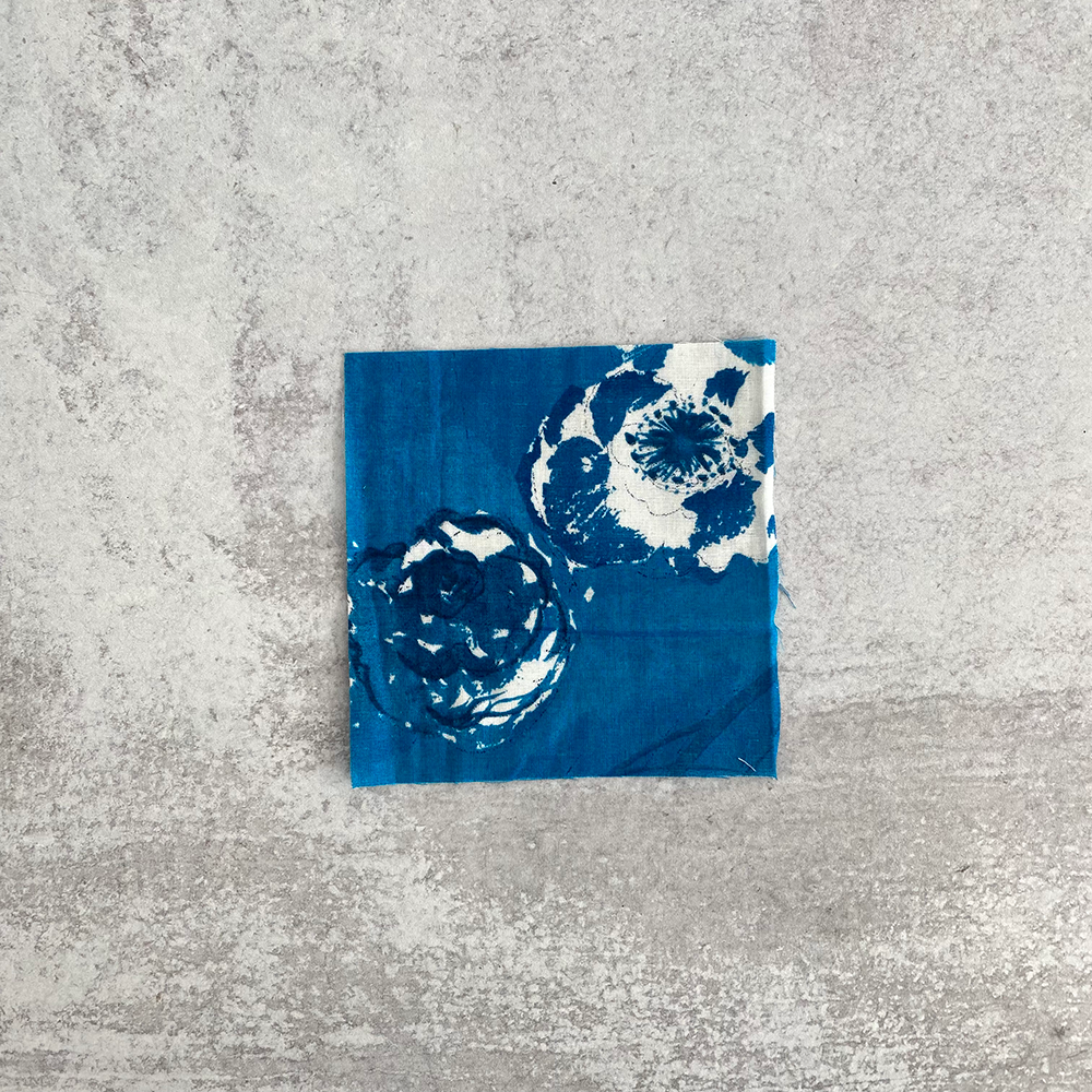
You may instinctively think it looks light or dark in value. But to determine its color value, we need is more information. Because you can’t determine what color value that blue print is if you look at it on its own. It needs other fabrics around it. Other fabrics around that blue print will help determine what its color value is, and vice versa.
Let’s add a fabric beside that original blue print-
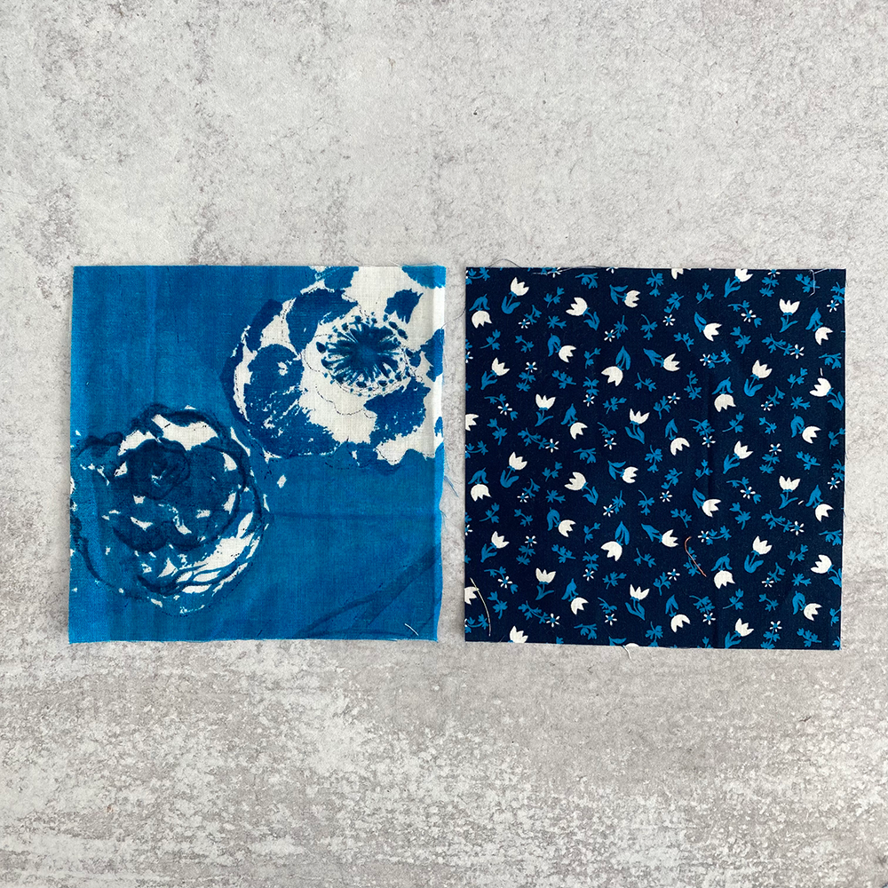
Based on what we see above, the original blue print is definitely the LIGHT value of the two, and the newly added print is the dark value. Can you see that? They are informing each other.
But…. what if we add a different print beside the original swatch?-
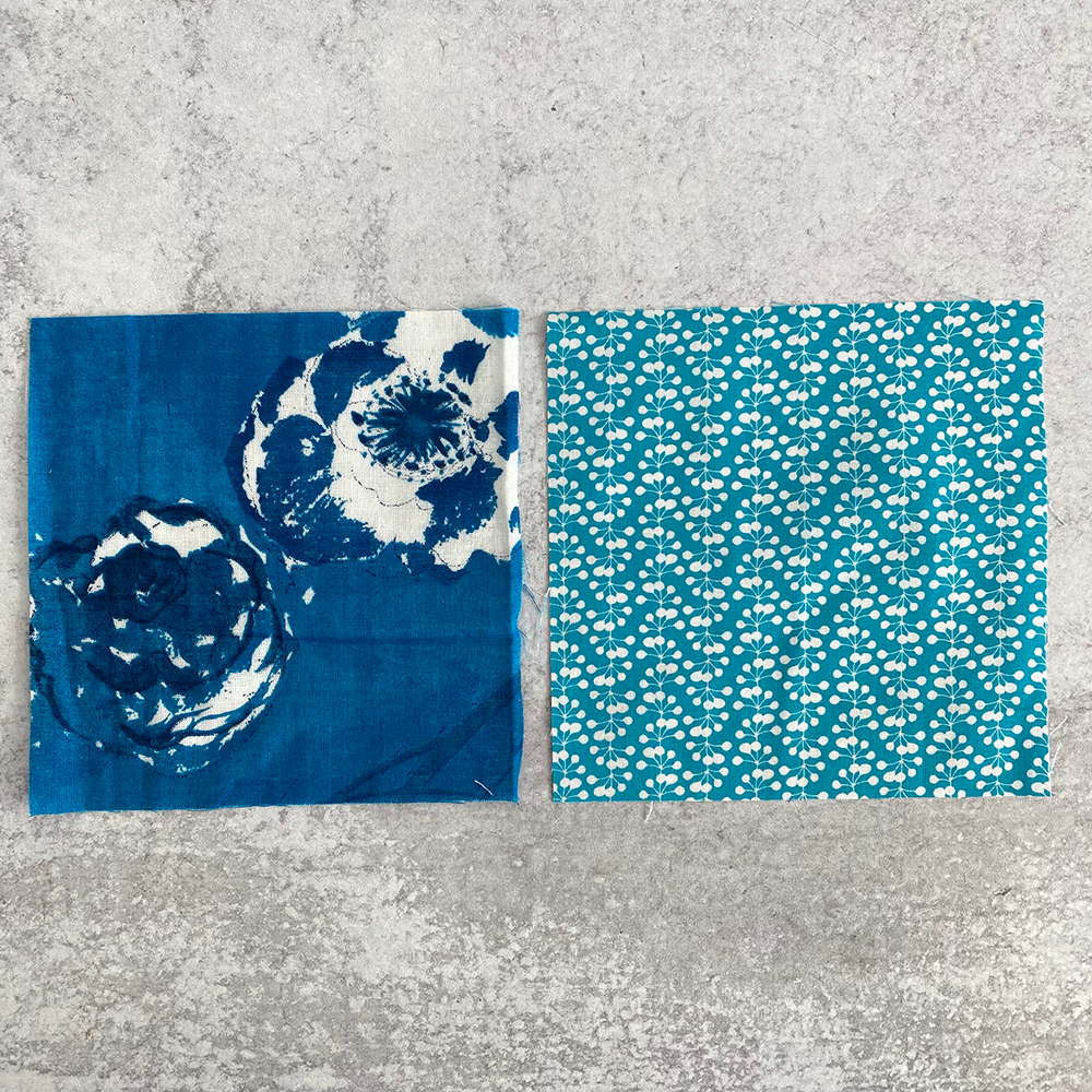
Now the original print on the left would be considered the DARK value, and the new fabric on the right would be the light value. Fabrics only have a color value when they have other fabrics around them. It is important that they relate to each other.
The color value of any fabric is relative to what other fabrics are around it
Each of the fabrics you choose for a quilt have color value that is relative, and will change depending on other the fabrics you place around it in the quilt design..
Try this-
Take some of your least favorite prints from your stash. Put them out on your worktable. Now pull some more favored prints from your stash and lay them out alongside the others. Do the favored prints make the less favored prints look dark or light in color value? Next add more fabrics around and go through the same thought- are these dark or light in value? Are they changing value? The more you add, the less the focus is on that least favorite print. Open your eyes up to the possibility of how you can use the least favorite print. Sometimes, a lesser favorite print could be the perfect light or dark value needed in a scrappy quilt design. Maybe some of the colors in that least favorite print can suddenly pop and show up a different way. By focusing on color value instead of color you can see different possibilities and new ways of using your fabrics together.
And let’s face it, most of us have more fabric than we will ever use. 🙋🏻♀️
We all likely look at our fabric stash and see colors first
Looking at the colors in your stash, do you start to consider color-related questions- like thinking you have “too much green” or “not enough warm colors”. Or maybe you feel you need more low-volume prints (a term to describe light colored fabrics with softer, lighter prints on them)? You may look at your fabric stash thinking “there’s a lot of blue” or “I need more lights”. I want to challenge you to look at your fabric stash in terms of light and dark color value, instead of purely color. Lay some of the fabrics out together on your work table and divide them up into dark and light value.
Try looking at your stash from a color value perspective. Here’s a simple experiment to try-
- Pull 20 or so “dark” prints from your stash. Don’t worry about whether or not they seem to have similar values. Just pull fabrics.
- Gather them all together on a tabletop, and do a quick sort of them, putting each one into a dark value pile and a light value pile. Each fabric should go into one pile or the other. Don’t overthink this process. You will start to notice that what at first felt like a whole bunch of dark fabrics are actually full of dark AND light values.
- Notice the many different dark values in the same pile. Same with light values.
Having lots of different light and dark values, but dividing them into only 2 categories is the first step in understanding how to play color value in a quilt. And it’s a really interesting way to view your stash.
In the video below, I will divide a group of unrelated print fabrics into dark and light color value-
Hopefully that showed you how easy it can be to sort fabrics into a dark and light color value group. It becomes less important that the fabrics are related design-wise, and more important that they accomplish what you want them to do color value-wise. And I mentioned my Ruby Ruler®️, more on that in a minute.
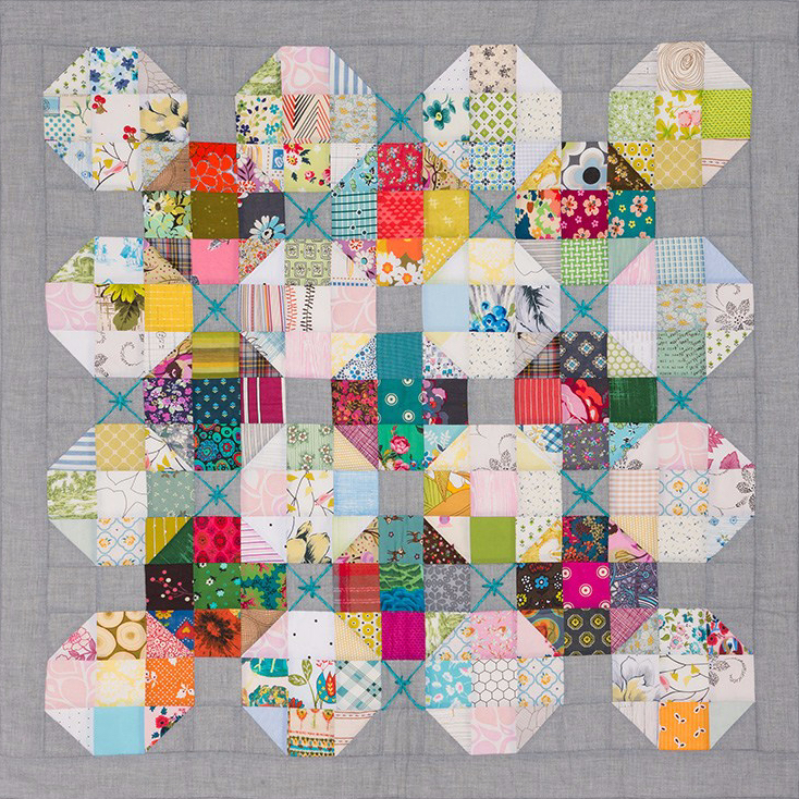
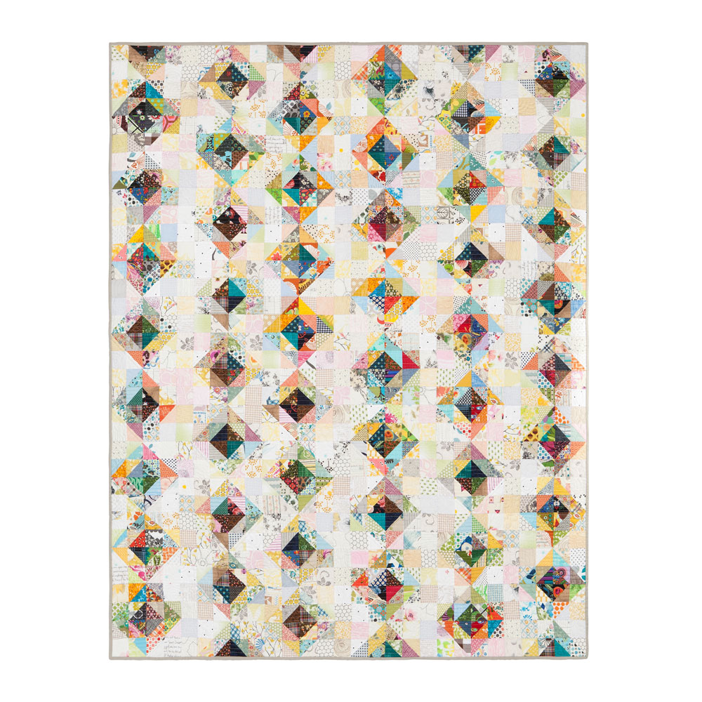
The scrappy half square triangle quilt below is made from all different kinds of Liberty of London prints. So many prints! A rainbow of colors! But they were all put into one of two categories- either dark or light color value for this quilt design. I love the “sparkle” in a quilt like this, because there are so many different dark values and light values, your eye travels across the design, and takes in different areas of the design where the fabrics seem to “glow”. When I look at this quilt, I see violet-purples, a lipstick pinkish-red, a bright yellow glowing from different areas. This happens because you have lighter dark values mixed with darker ones, same with the light value stack. Not every single light value fabric has to be exactly the same value as the other fabrics in the same stack. In fact, its better to have a variety of light values, and a variety of dark values.
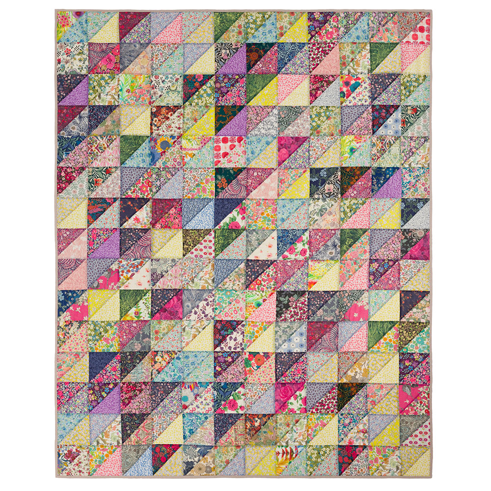
Liberty Scrap Quilt, made for my online workshop Make Modern Scrap Quilts Using Color Value
The importance of those value relationships that feel “too” close
Often my students will shy away from pairing up any two fabrics that feel close in color value. But wait! If you have fabrics in one pile that seem very close to some in the other color value pile, don’t decide against using these just yet. These very subtle value differences are part of what can make your quilt sparkle! They can feel tricky to work with at first, but they add a lot to any color value equation, and it’s worth understanding how to work with them.
Back in 2017, I designed my Ruby Ruler®️ to help viewing color value in my quilts, but it also really helps to see those closer values better. The concept of the ruler is a simple one. It is a red tint, and when the ruler is held up between your eyes and your quilt layout, or fabric choices, it can help you focus more on the overall values and forms you see, rather than the individual colors, because it distorts them. Stopping and doing a quick value check on your layout periodically throughout the design process allows you to make true design decisions about your quilt.
This ruler is also great for studying those really close value relationships between two or more fabrics. These are the true magical part of a color value based design. Placing those dark and light value prints side by side that have closer value relationships can create a truly sparkly effect in your quilt.
The Ruby Ruler®️ can also help you check the overall layout of your design. Just stand back from your design wall, and look through the ruler to view it from a value perspective.
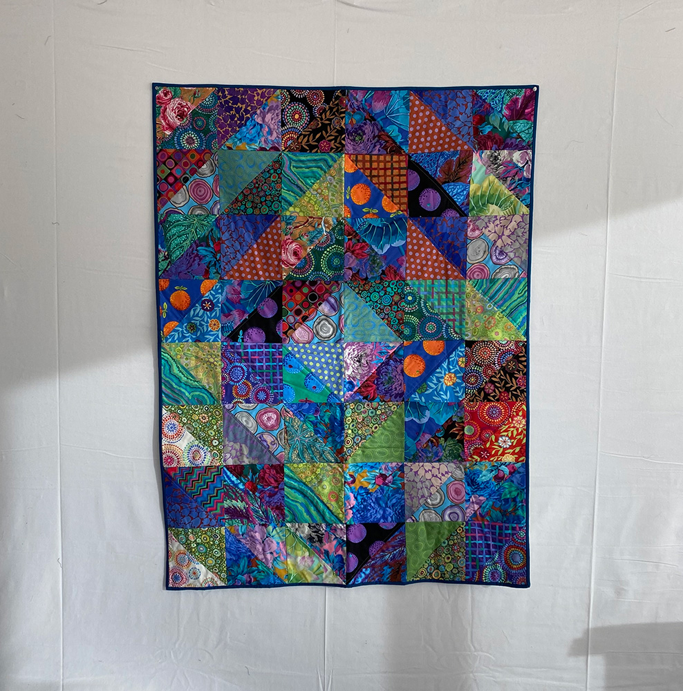
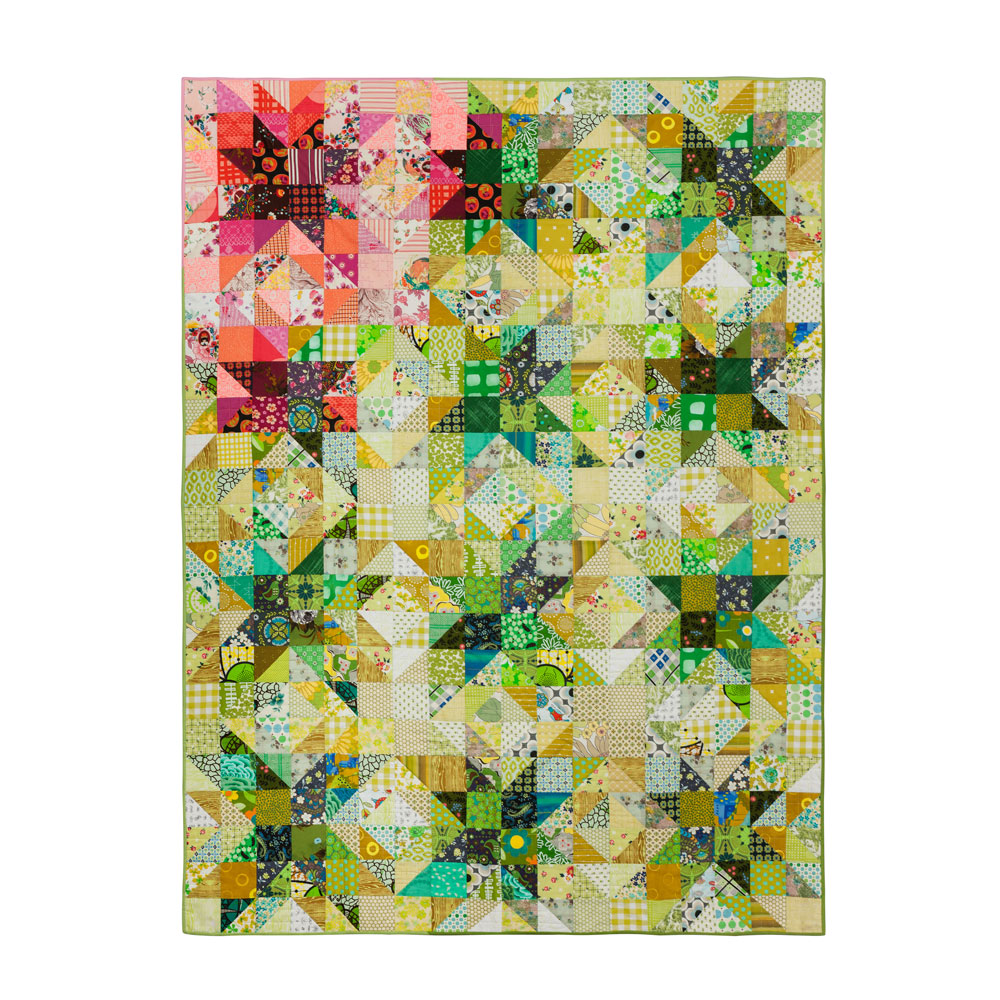
The quilt above is made entirely of Kaffe Fassett prints. His fabric prints are characteristically very colorful, usually larger scale, saturated, sun-drenched jewel tones. At first glance, all these fabrics together may all feel like dark-valued prints. But as you can see, I’ve been able to tease out some light values along with the dark values. My Ruby Ruler®️ was right by my side and in use almost constantly while I was laying out this quilt.
Pro tip- I cut and square up units with the Ruby Ruler®️, and will also use it to fussy cut a particular section out large dark print, like one of Kaffe’s. I’ll lay the ruler over the print until I find the exact area I want (maybe I want the lighter valued area of the print, for example). Then I’ll cut around the ruler.
Other tools and tricks to look at your layout and see the color value
I can’t stress the importance of standing back from your value quilt layout often, so you can view it from a distance. Having a design wall is ideal (here’s how I make a portable design wall). Take the whole design in at once. It can be difficult to see what is happening when you stay visually close to the design.
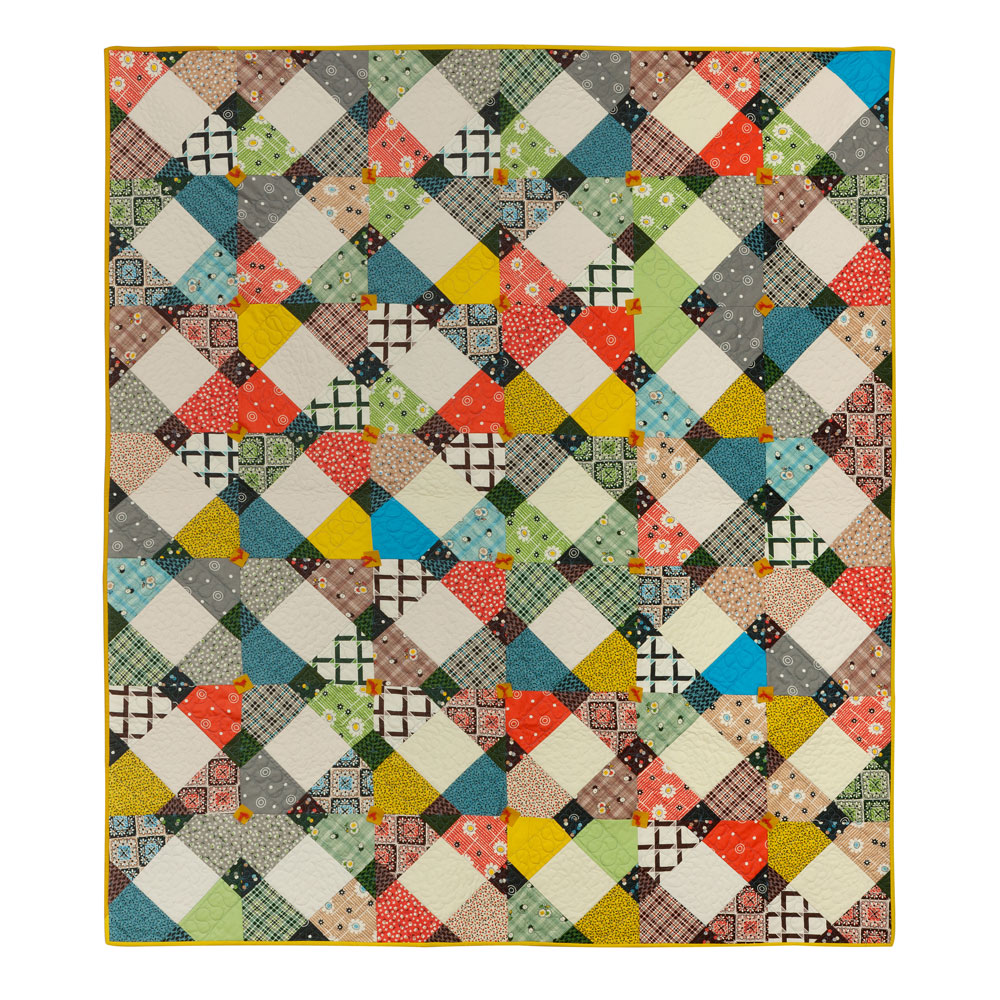
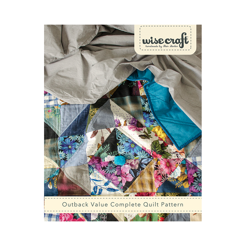
This quilt, from my book Wise Craft Quilts, actually has a missing light-valued column in the layout because I didn’t follow my own advice to stand back and double check the layout.
“Value” from the Wise Craft Quilts book
When you stand back, there are a couple of tricks I recommend to help you view your values, colors, and design all at once.
- Take a photo of the entire layout with your phone, then change the settings to black and white, to take in your layout without focusing on individual colors.
- Look through my Ruby Ruler®️ at your layout on your design wall. Hold the ruler 6-12″ away from your eyes, and look through it at your layout. Notice the “lighter light” values, the “darker dark” values, etc. I will often hold the ruler in front of my eyes, look through it, then quickly move it to look at the layout with my naked eye, then move the ruler back in front of my eyes, etc. Doing this helps several times as I look around the layout helps me look at each section to make sure the values are doing what I’d like them to do. (See exactly how I use the ruler in this video.)
Now it’s your turn!
Jump in and make a value quilt with your own fabric stash-
Download the Outback Value Quilt Pattern for free!
If you are ready to try your hand at making your own value quilt, you’re in luck. Download my free quilt pattern, Outback Value, and make a scrappy value quilt. Outback Value is a favorite of many who have taken my value classes and used the Ruby Ruler®️. The perfect starting point to try your hand at this whole value thing. Be sure to check out the #outbackvaluequilt hashtag on Instagram to get some beautiful inspiration!
And if you’d like to go even deeper into color value, and learn how to design your own scrappy, value-based quilts, you can take my online class Make Modern Scrap Quilts Using Color Value. You can access the entire class immediately after purchase and ask me questions directly throughout the lessons. (And you own it forever! So you can go back anytime for a refresher!)