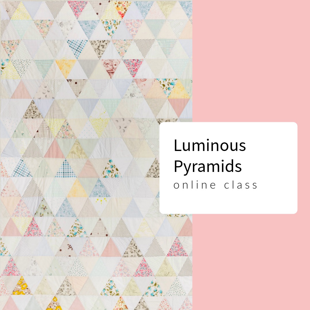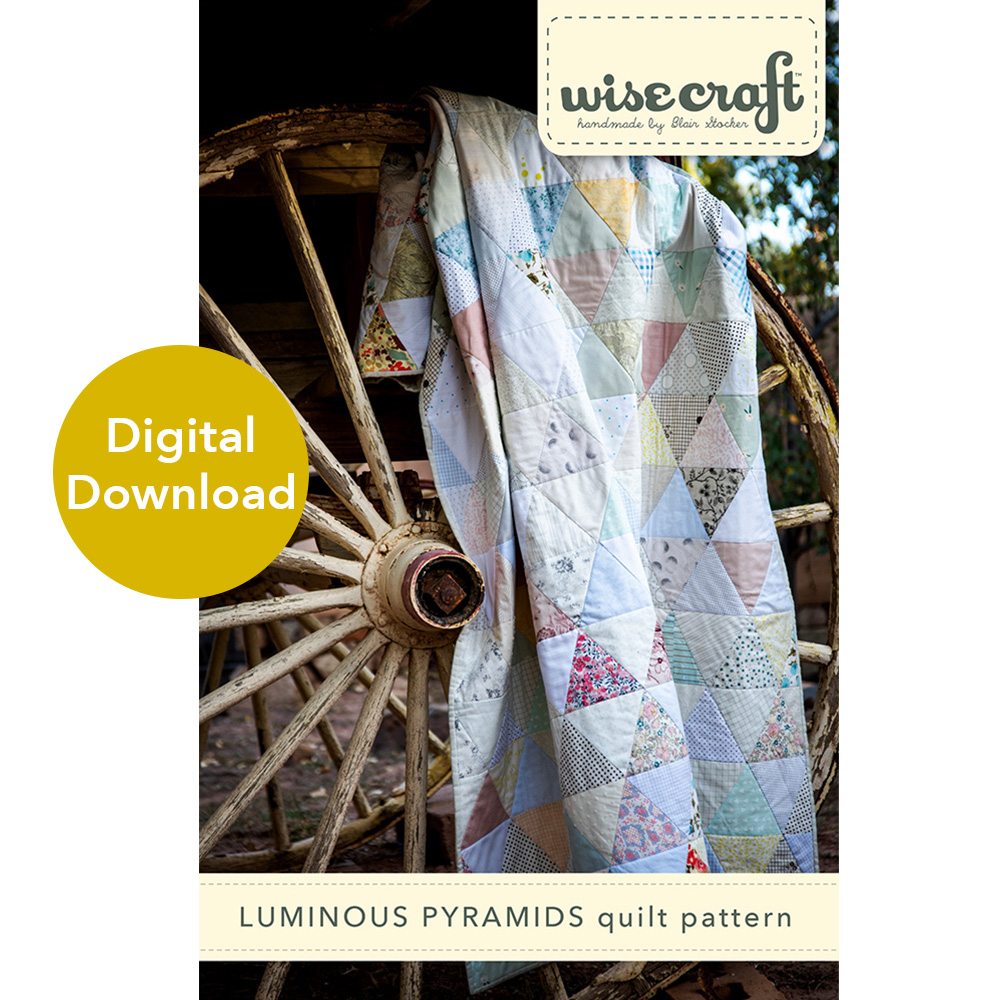

I am currently making a basic thousand pyramid quilt design for our bed, and cutting lots of ” equilateral triangles. I plan to pull all of the lighter fabrics from my stash to build this design. A king sized bed takes up lots of visual room in any bedroom and I don’t want this to be an overwhelming presence. So nothing crazy. Plus, if I use all my light colored fabrics in my stash, I will have the perfect excuse to buy more, right?
When building a scrappy quilt design using the power of color value, as I plan to do, understanding that not all light colored fabrics are light in value can take your quilt to new levels. (This also applies to dark fabrics too.) Let me explain what I mean.

Understanding color value differences between two light-colored fabrics
Light colored fabrics in my stash are usually 2-color, very light shades, like the one above. However, that doesn’t mean they are all of the same value. (You may have heard this referred to as low volume.)

Two light fabrics like the ones above, placed side by side, look quite similar in value at initial glance. But trust me when I tell you that there’s always value difference to detect.

Using my Ruby Minder™ (which works as a value lens the same as the Ruby Ruler®), I hold it midway between the fabric and my eyes. (I do not hold it directly in front of my eyes and I don’t lay it directly on the fabric.) It may be hard to see well in the photo above, but the ruler is showing me that the fabric on the left definitely has a darker value than the one on the right.
When I am actively looking at fabrics to decide value, I will often move the value lens away, then back again, in quick succession. It becomes very second nature to do this, and it helps me to look at the fabrics both ways.
Understanding color value differences between several light-colored fabrics
When you look at several light fabrics, like the ones above, and keep the idea of value in your mind, you can start to see even more value differences!
Again, not always easy to see in a photograph, but looking through Ruby Minder™, above, is showing me that every other triangle in my layout is darker than the ones on either side of it. When you take the ruby away, you may not see it as distinctly, but it is there.
You may find yourself saying “why would such a slight value difference even matter?” Well, it matters a lot! If you have ever taken a workshop from me, or heard a lecture, you will hear me discuss “quilt sparkle”. As I am laying out the thousand pyramid pattern with attention to dark and light value (photograph above), its not obviously dark and light value differences to our naked eye. Up close, its hard to not look at each fabric print by print. But once the whole top is laid out, and the quilt is viewed in its entirety, the viewer’s eye will pick up on the repeating patterning created in the design, using value.
I refer to this as “quilt sparkle”. Although the above layout is FAR from done, it will become more cohesive with every new row I add. The overall pattern will start to reveal itself. By recognizing subtle value differences like this, and repeating them all over your quilt, a story begins to emerge. You are forcing the viewer to see something that they would not see unless you showed them “how” to see it.
Blair, what the heck is “quilt sparkle”?
In a word- everything! Quilt sparkle is a term I use to describe the subtle color and value depth used effectively in a quilt. Do you ever look at a quilt design and feel like its just a little flat, or something doesn’t feel quite right? Your design may lack attention to value. Understanding this concept and using it effectively in your design process truly is where a design truly becomes your own! It creates a design confidence in your work.