tour the dining room, or, a redo for the cost of a can of paint, so stay with me here
I haven't forgotten the dining room. I really haven't! Do you remember how it looked before? Let's have a quick refresher…
Before…
dark, black, hard to photograph, not awful, but hardly used, too formal.
And then I shared some tear sheets I'd been collecting.
And here's what happened with all that, once it got into my brain and stewed a while.
After…
I have once again proven to myself that the Swedish really get it right in my book (all that white and bright on Camilla and Elizabeth's homepage there really illustrate it well).
Like Sweden, the pacific northwest is notoriously dark throughout the winter months, and it can really save the psyche to keep that in mind when decorating. As much as Peter and I are fans of color, lightness makes all the difference in this room. Its gets weird Eastern light blasting through those french doors until about noon, then it just goes dark. But now it feels much airier, truly like a deep breath.
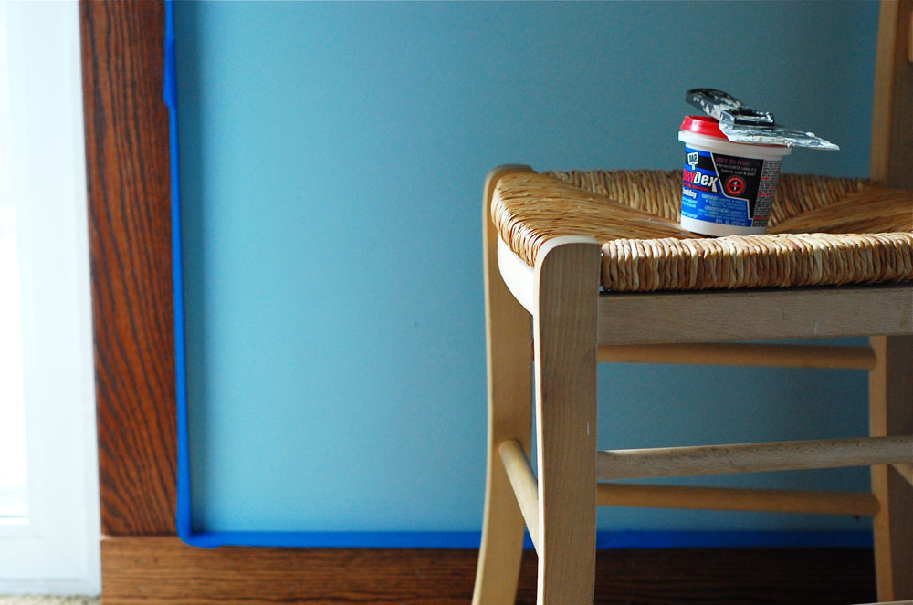
The biggest change in creating that feeling in here is the paint color. About a year ago, my friend Neicy called my attention to what has since become my favorite wall color, Ben Moore's Vanilla Milkshake (not to be confused with Vanilla Ice Cream, also a color they carry) . It is a white with a lot of interest, depth, and a cast that really changes with the light, and it contrasts nicely with the chestnut colored box beams on the ceiling of this room (which you can't see well in these photos). It transformed the walls of our family room, and now in here. (Perhaps in the new year it will transform our hallway, I'm really done with the beige.)
Once again, before,
After…
The chairs and table are IKEA. Going into this project, I didn't want heirloom anything for this room. I really hoped that this room would be used, it has always felt quite forgotten. I wanted it to feel happy. So I went for furniture that felt light, useable, and let's face it, IKEA fit within our budget. The table is long and extendable (I went for a long size, but in fact, I should have gone for an even longer one, I keep it fully extended). The chairs have an interesting shape, and a white seat. I love them. They feel modern and simple, and I realize this is where our tastes are heading. They also go nicely with the end chairs, which are upholstered ones Peter bought in St. Louis (and why I married him). In the top photo, we had already changed our overhead light fixture to a softer light, more interesting shape. The one before cast really unflattering, clinical light that would not dim (another reason we never ate in here).
The tiny original painting of Montemartre was one I bought from a street artist in Paris. The bottom piece is of the Wet Mountains in Colorado. The beautiful glowbowls were made by Diana Fayt. The soft twig was made by Stephanie.
The Liberty of London curtains I'd made years ago (which were extremely faded) were switched out for a simple white coarse weave cotton with a textured black stripe going through it (again, thank you IKEA), also helping to lighten the space visually. The artwork in the room all has significant meaning to us. And those porcelain glowbowls look amazing and etherial at night.
We dug through the stacks and stacks of artwork we had in the basement and pulled out all new pieces for the walls. These two watercolors were done by Peter's grandmother Marjorie. I had them rematted in acid free materials (sadly, the edges of them of are crumbling) and we're both so happy we can now look at them every day.
My embroidery hoop "installation" remained, we all like it. The lampshades were switched from red ones to white ones, huge difference in the amount of light we get from them now.
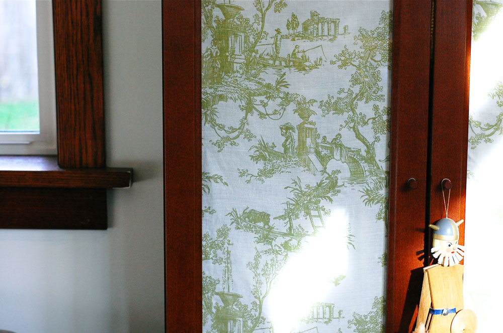
I made new cushions for the bench (the before here) from those amazing old curtains I found secondhand a few months ago.
I had plans to repaint the sideboard a bright color, but to be honest we all liked it much better as it is after we lightened the room up, so I've decided to live with it for now (with new knobs from Anthropologie). That stool, above on the left, is the same one from the holiday photo shoot and a large plant will live on it soon, once I decide on one.
Now. The big clincher, that I hadn't realized until the redo was complete? All of this costs me the price of-
1 can of paint- $50
1 roll of painter's tape- $5.00
Thrifted fabric for cushions- $5.00
That's it.
I'm not kidding.
You see, we sold the original table on craiglist for a decent price, which in turn created my IKEA budget. Granted, we didn't change many things that are in here, but I accomplished my goal of a family-friendly, airy space. We now eat dinner in here every night. Emma and I craft in here, it doesn't feel like wasted space any more.
Little changes that made a big impact. I keep saying it, but it doesn't have to cost a fortune to design and create your home with intention.
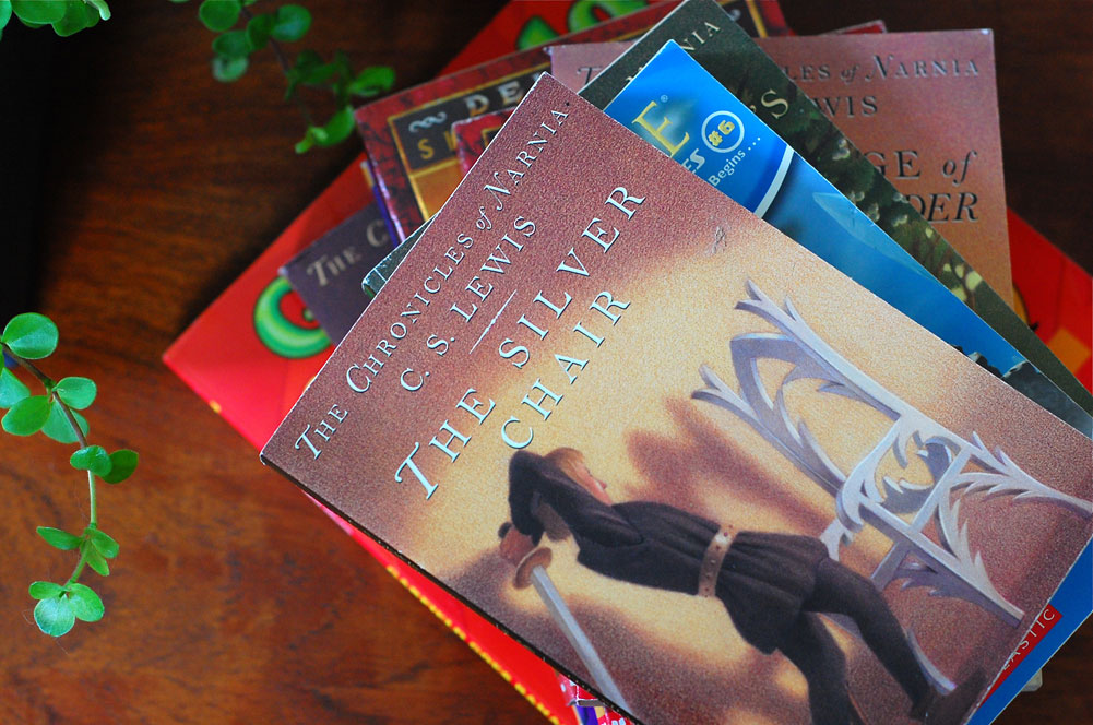
A few of the many books that inspired me:
Lotta Jansdotter Handmade Living
Now there's some goodness to add to your holiday wishlist.
Oh, and the tablerunner, more on that soon.
Thanks for reading this far!


