
Ready for your Week One assignment? I just finished up our first live video** in the Wise Craft Quilts FB Group for the Boro quilt and wanted to recap here (because some of us hate Facebook and I totally get that!).
This week are kicking off our Boro project and making a couple of decisions to get us started.
Questions to answer this week:
What size will your quilt be- Small, wallhanging size? Bed Quilt? Somewhere in between?
Be realistic about what size you feel you could finish. Some of us will be ready to jump in and do a quilt and have the time and headspace set aside to do so. Others might be very interested in only learning the technique and trying it out, so they might opt for a smaller, wall hanging size instead. The original quilt from the book is a throw size quilt, to give you perspective. I have also made mini versions of boro quilts and they were different, but just as fun!
What will your inner layer be- lightweight/cotton fabric? Or traditional batting?
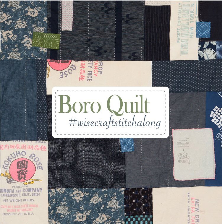
A little background on the Boro quilt in the Wise Craft Quilts book. It has no batting inside, just a layer of muslin. Japanese Boro is traditionally a cloth, not a quilt, and I was interpreting the idea of boro into a quilt-like piece. (I created a Pinterest board for inspiration and reference.) I thought it would be interesting to make a summer weight quilt for warmer weather. A coverlet, not too heavy. So instead of batting being the center layer of this quilt, I went with a layer of quilter’s muslin. You can choose to do the same, or you can make it with batting like a traditional quilt. You can hang it on the wall, throw it over a bed when a heavy quilt is too much, cover a sofa back with it, to have for cooler nights. For the new version I will make for the stitchalong, I plan to use batting.
What will your colors/fabrics be?
The big decision to make this week is choosing your fabrics and colors. I designed the original quilt using the concept of 3 different groupings of color, which I’ve created a super technical name for… Are you ready?? The Color Palette Triangle.
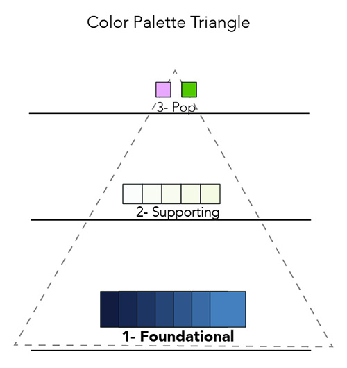
Here’s how it works, described in order of most predominant color to least.
1- Foundational
This biggest part of the palette. In my original quilt, I used several blues as my foundational palette range (you could choose any color you want, don’t feel obligated to use blue). I went to my stash, pulled any and every blue fabric I thought might work, regardless of size, and put them out on my table. The variety I chose were different values of blues, some light, some dark. This is totally ok, they don’t need to be all the same depth of color. At least at this stage of the process.
Have a wide range of fabric options for the foundational color in the beginning, and as the quilt starts to come together, some of them will naturally drop off or not feel right. Others that you were “eh” about might just be the perfect shade, pattern, or value you need.
2- Supporting
Once you have your foundational color chosen, you’ll want to choose a supporting range. In the original Boro quilt, I knew I wanted to use vintage feedsack pieces I had collected. So, I chose creams for my supporting color palette. Whatever this color is, it should be a strong value and color contrast to your Foundational color. That is what gives this quilt a graphic quality and will define the forms and shapes that make up the quilt.
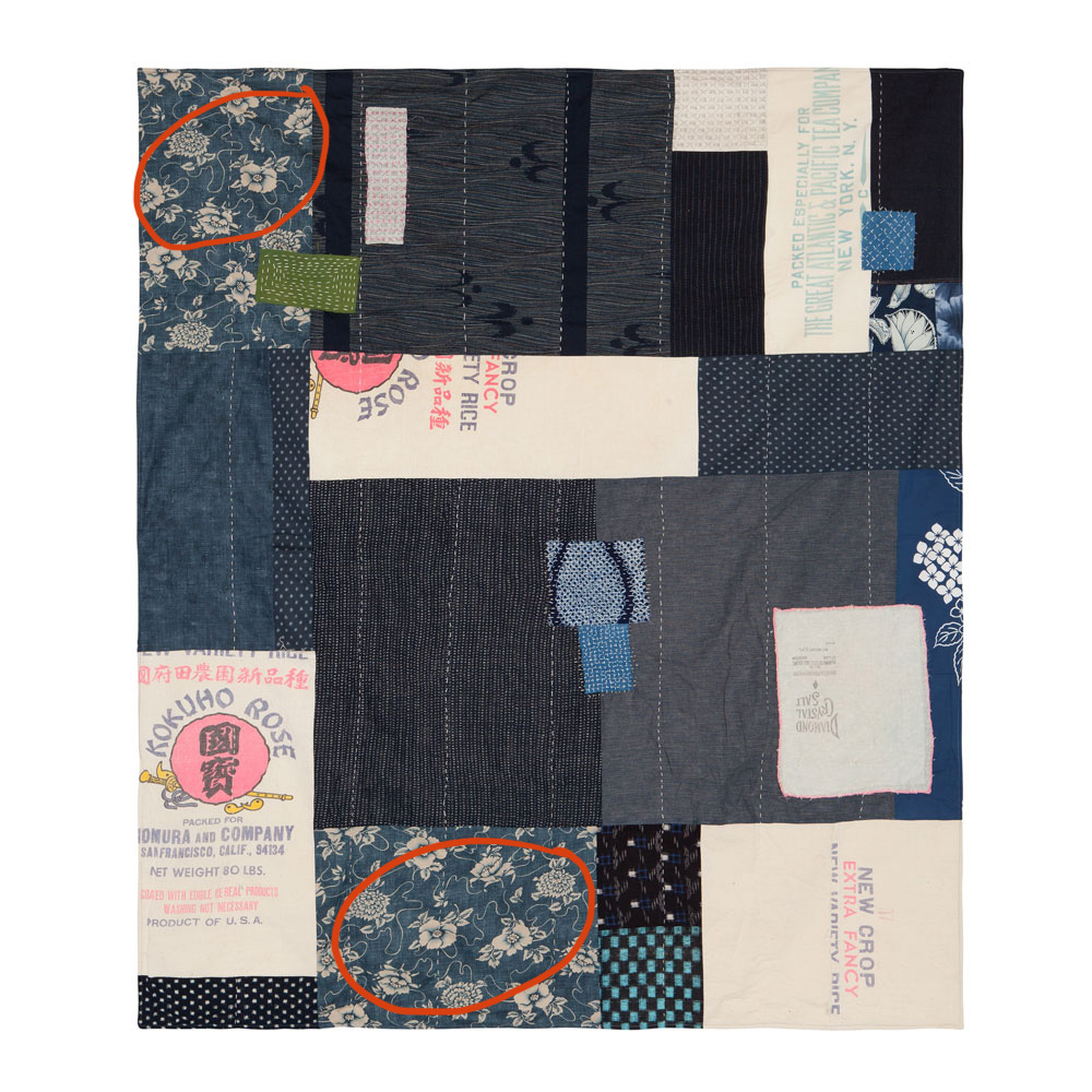
I pulled the feedbacks, and put them on my worktable next to my foundational fabrics. It was then I realized that one navy and cream print I’d originally put in the foundation pile, but was not sold on it because it felt busy, suddenly felt perfect! (Circled in red below.) The cream in that print would work with the cream shade of the feedsacks. Its decisions like these you’ll start to make this week.
3- Pop
This one is just what it says. A small amount of “BAM” here and there on the quilt top. The little spots your eye will pick up on from across the room. Interesting, but never overpowering. You may only need one, or two like I went with. I chose pink because my feedsack fabrics had pink lettering on it, and I loved the contrast against the blue. I also chose a pea green shade for just a couple of patches. A few spots of strategically placed Pop is all you need.
And keep in mind that it is perfectly acceptable to use hand sewing thread in your Pop color(s) as well for contrast, it doesn’t always have to be a fabric contrast. The hand stitching will come later in the construction, but any time you have a good idea for where some hand stitching should go, make a note of it to refer back to later.
Download a copy of the Color Palette Triangle.
The next FB Live video will be in the Wise Craft Quilts group next Wednesday, 11/7, at 4:30pm Pacific Coast/Seattle time. All lessons and posts will live in this post.
Follow me on Instagram for updates over there
**Members can watch the video replay in the Facebook Group by going to the group page and clicking on “video” on left side of screen for desktop, and clicking on “albums” on mobile.